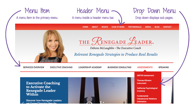
At the most basic level, a navigation menu is a collection or list of links. The most common placement of a menu is in the site navigation area or navigation bar and is referred to as a navigation menu.
Each link in a menu is called a menu item. Some menu items may have sub-menu items that are displayed in a drop down menu.
EXAMPLE: A basic website navigation menu may include menu items such as About, Services, Products, Testimonials, and Contact. The Services menu item may display a drop down menu, with the sub-menu items Private Consulting, Group Training, VIP Day.
navigation menu should be responsive in relevance to all devices.
HTML Code to make responsive navigation menu
<!DOCTYPE html>
<html>
<head>
  <title></title>
</head>
<body>
<header>
<section>
<a href="" id="logo">My Blog</a>

<label for="toggle-1" class="toggle-menu"><ul><li></li> <li></li> <li></li></ul></label>
<input type="checkbox" id="toggle-1">

<nav>
<ul>
<li><a href="#logo"><i class="icon-home"></i>Home</a></li>
<li><a href="#about"><i class="icon-user"></i>About</a></li>
<li><a href="#portfolio"><i class="icon-thumbs-up-alt"></i>Products</a></li>
<li><a href="#services"><i class="icon-gear"></i>Contact</a></li>
</ul>
</nav>
</section>
</header>
</body>
</html>
CSS Code
<style type="text/css">
  *{text-decoration:none; list-style:none; margin:0px; padding:0px; outline:none;}
body{margin:0px; padding:0px; font-family: 'Open Sans', sans-serif;}
section{width:100%; max-width:1200px; margin:0px auto; display:table; position:relative;}
h1{margin:0px auto; display:table; font-size:26px; padding:40px 0px; color:#002e5b; text-align:center;}
h1 span{font-weight:500;}

header{width:100%; display:table; background-color:#333; color: white; margin-bottom:50px;}
#logo{float:left; font-size:24px; text-transform:uppercase; color:white; font-weight:600; padding:20px 0px;}
nav{width:auto; float:right;}
nav ul{}
nav ul li{float:left;}
nav ul li:last-child{padding-right:0px;}
nav ul li a{color:white; font-size:18px; padding: 25px 20px; display:inline-block; transition: all 0.5s ease 0s;}
nav ul li a:hover{background-color:#002e5b; color:white; transition: all 0.5s ease 0s;}
nav ul li a:hover i{color:white; transition: all 0.5s ease 0s;}
nav ul li a i{padding-right:10px; color:#002e5b; transition: all 0.5s ease 0s;}

.toggle-menu ul{display:table; width:25px;}
.toggle-menu ul li{width:100%; height:3px; background-color:white; margin-bottom:4px;}
.toggle-menu ul li:last-child{margin-bottom:0px;}

input[type=checkbox], label{display:none;}

.content{display:table; margin-bottom:60px; width:900px; background-color: red}
.content h2{font-size:18px; font-weight:500; color:#002e5b; border-bottom:1px solid #fde428; display:table; padding-bottom:10px; margin-bottom:10px;}
.content p{font-size:14px; line-height:22px; color:#7c7c7c; text-align:justify;}

footer{display:table; padding-bottom:30px; width:100%;}
.social{margin:0px auto; display:table; display:table;}
.social li{float:left; padding:0px 10px;}
.social li a{color:#002e5b; transition: all 0.5s ease 0s;}
.social li a:hover{color:#fde428; transition: all 0.5s ease 0s;}

@media only screen and (max-width: 1440px) {
section{max-width:95%;}
}

@media only screen and (max-width: 980px) {
header{padding:20px 0px;}
#logo{padding:0px;}
input[type=checkbox] {position: absolute; top: -9999px; left: -9999px; background:none;}
input[type=checkbox]:fous{background:none;}
label {float:right; padding:8px 0px; display:inline-block; cursor:pointer; }
input[type=checkbox]:checked ~ nav {display:block;}

nav{display:none; position:absolute; right:0px; top:53px; background-color:#002e5b; padding:0px; z-index:99;}
nav ul{width:auto;}
nav ul li{float:none; padding:0px; width:100%; display:table;}
nav ul li a{color:#FFF; font-size:15px; padding:10px 470px; display:block; border-bottom: 1px solid rgba(225,225,225,0.1);}
nav ul li a i{color:#fde428; padding-right:13px;}
}

@media only screen and (max-width: 980px) {
.content{width:90%;}
}

@media only screen and (max-width: 568px) {
h1{padding:25px 0px;}
h1 span{display:block;}
nav ul li a{color:#FFF; font-size:15px; padding:10px 300px; display:block; border-bottom: 1px solid rgba(225,225,225,0.1);}
}

@media only screen and (max-width: 480px) {
section {max-width: 90%;}
}

@media only screen and (max-width: 360px) {
h1{font-size:20px;}
nav ul li a{font-size: 15px}
label{padding:5px 0px;}
#logo{font-size: 20px;}
nav{top:47px;}
}

@media only screen and (max-width: 320px) {
h1 {padding: 20px 0px;}
.toggle-menu ul {width: 100%}
}


</style> deamatsoftwareplc.code.blog
Leave a comment